Client: Smagała Strzelczyk
Challenge: The challenge was to create a premium yet distinctive legal identity.
I started by analyzing the legal services market, studying how premium law firms visually communicate trust, professionalism and clarity. One insight stood out: lawyers are often referred to as “papugi” (parrots) in slang, so I embraced that metaphor as a creative pivot. From there I focused on setting Smagała Strzelczyk apart from typical law firms by finding a visual identity that feels both modern and timeless.
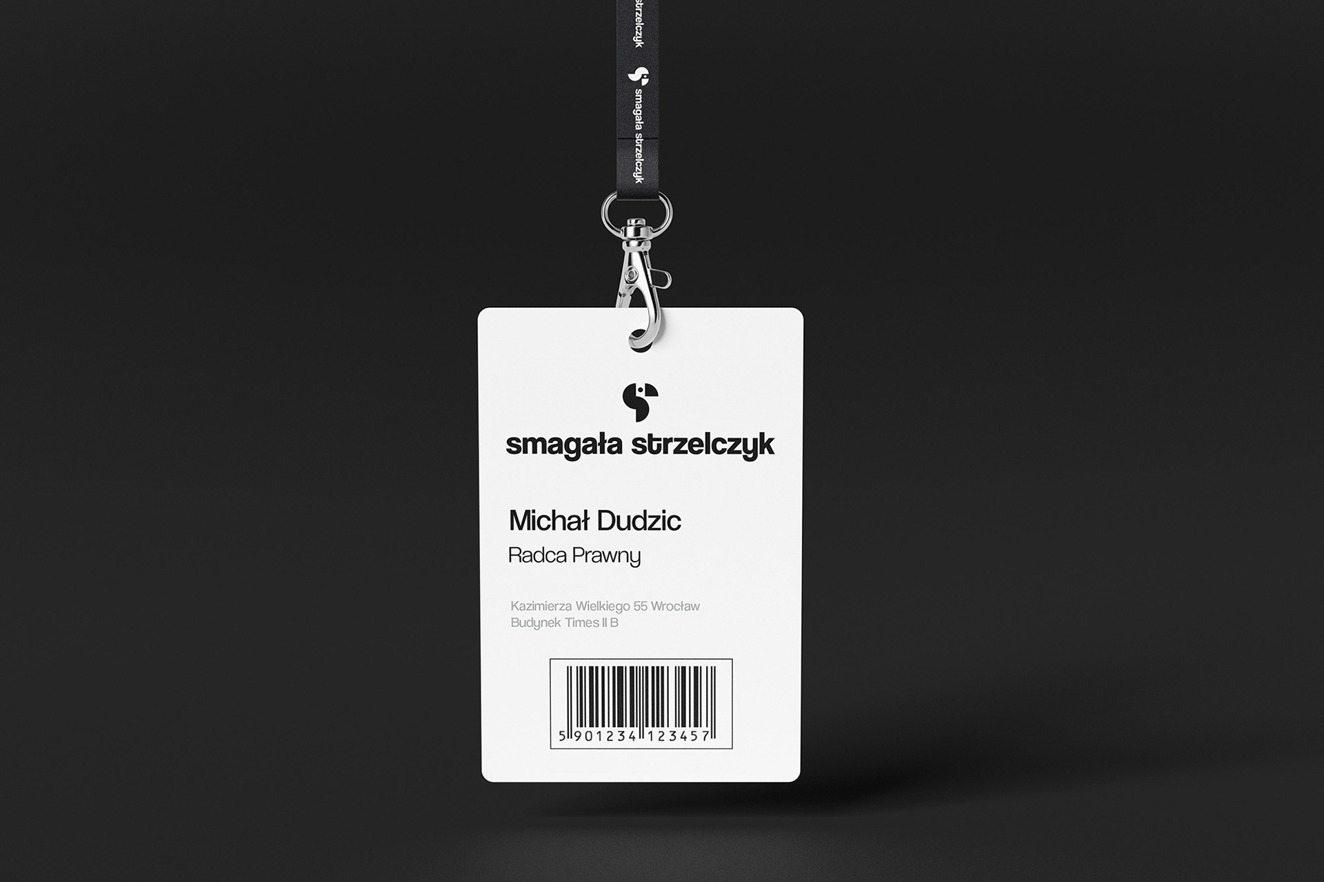
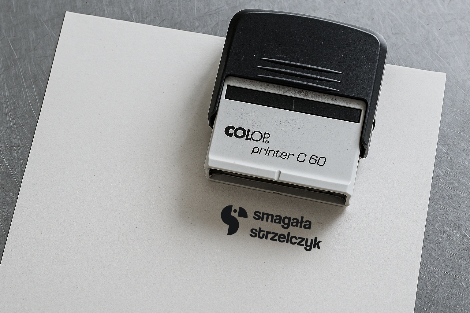
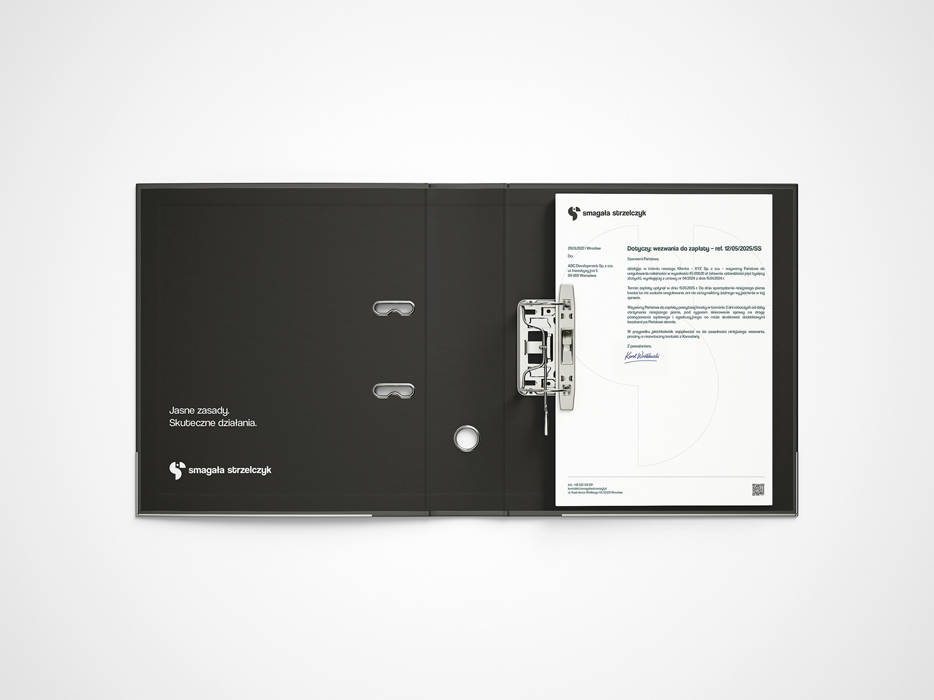
I designed a minimalist logo featuring a Bauhaus inspired parrot symbol, using a monochrome palette and clean, modern typography. I emphasized simplicity and precision, ensuring that every element from stationery to digital screens conveys competence and premium quality. On the development side I built a responsive website with intuitive navigation, SEO friendly structure and a lead oriented contact form, making the online presence not only aesthetic but also functional.
In testing and rollout I ensured the identity performed in different contexts such as business cards, stationery, mockups and animated logo treatments. The final delivery included complete brand guidelines and visuals that elevate Smagała Strzelczyk’s voice. The result is a brand that looks premium, feels consistent and clearly positions the firm at a higher tier in the legal market.

Sign construction
Protective area of the mark

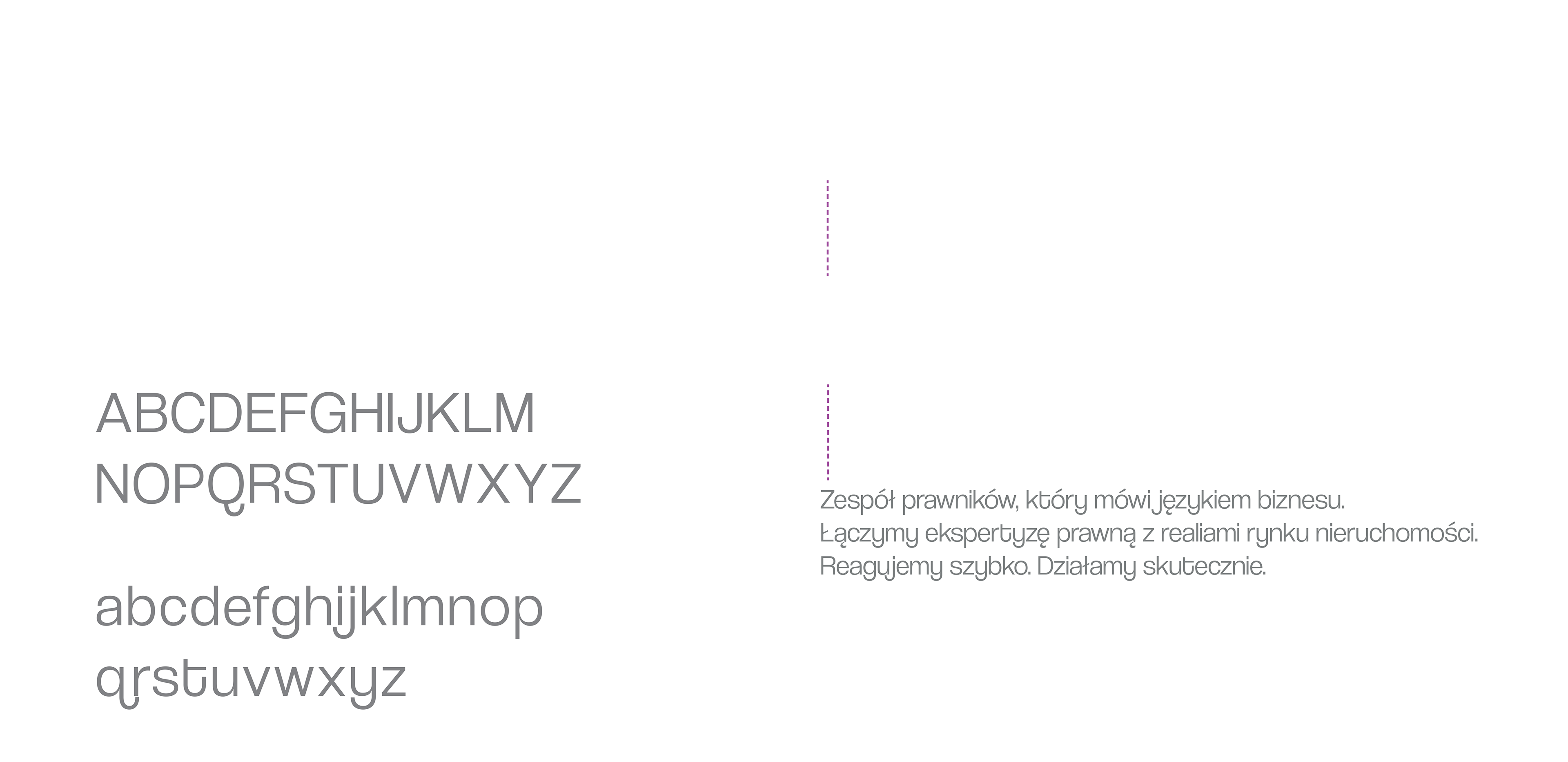
Typography
Displaying the mark on various backgrounds