Client: UMWD
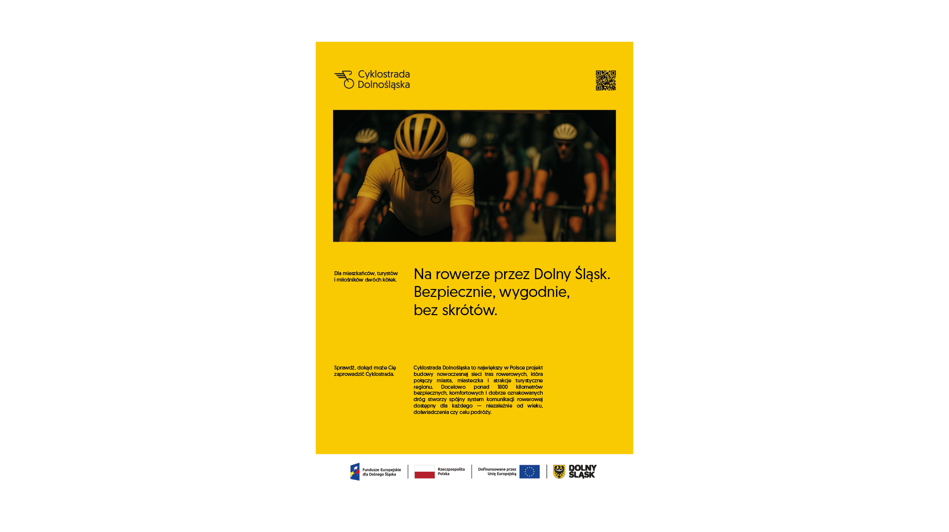
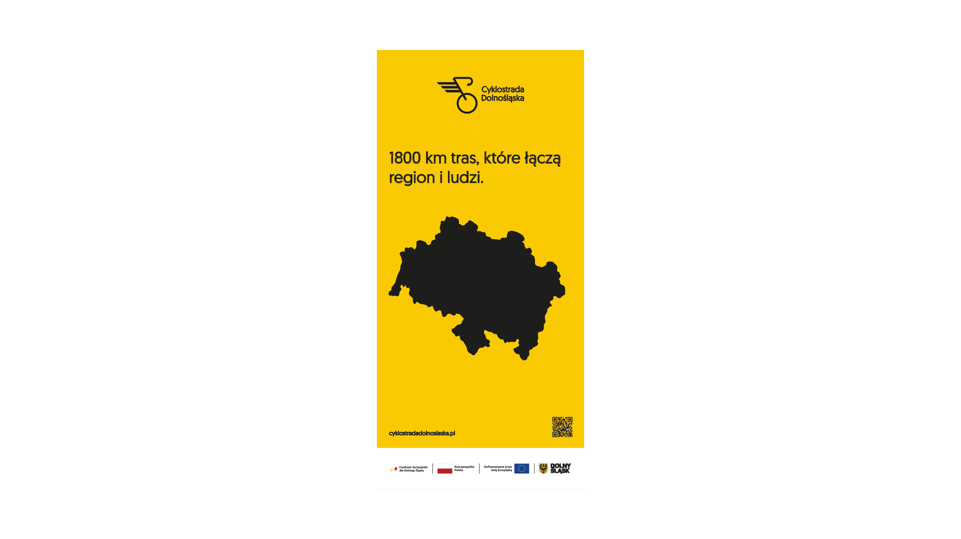
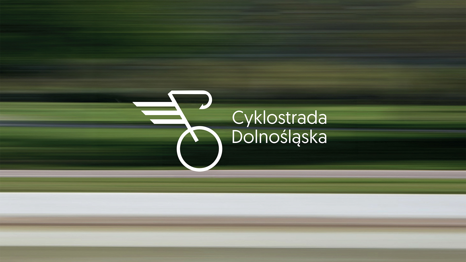
Challenge: Visual identity for a new network of bicycle routes in Lower Silesia
I began by observing how cyclists, families and tourists moved through the region. Their daily routines and the functional needs of the network shaped the direction of the project. The goal was to create an identity that could guide, inform and inspire at the same time, clear in function, dynamic in expression and open to everyone using the routes.
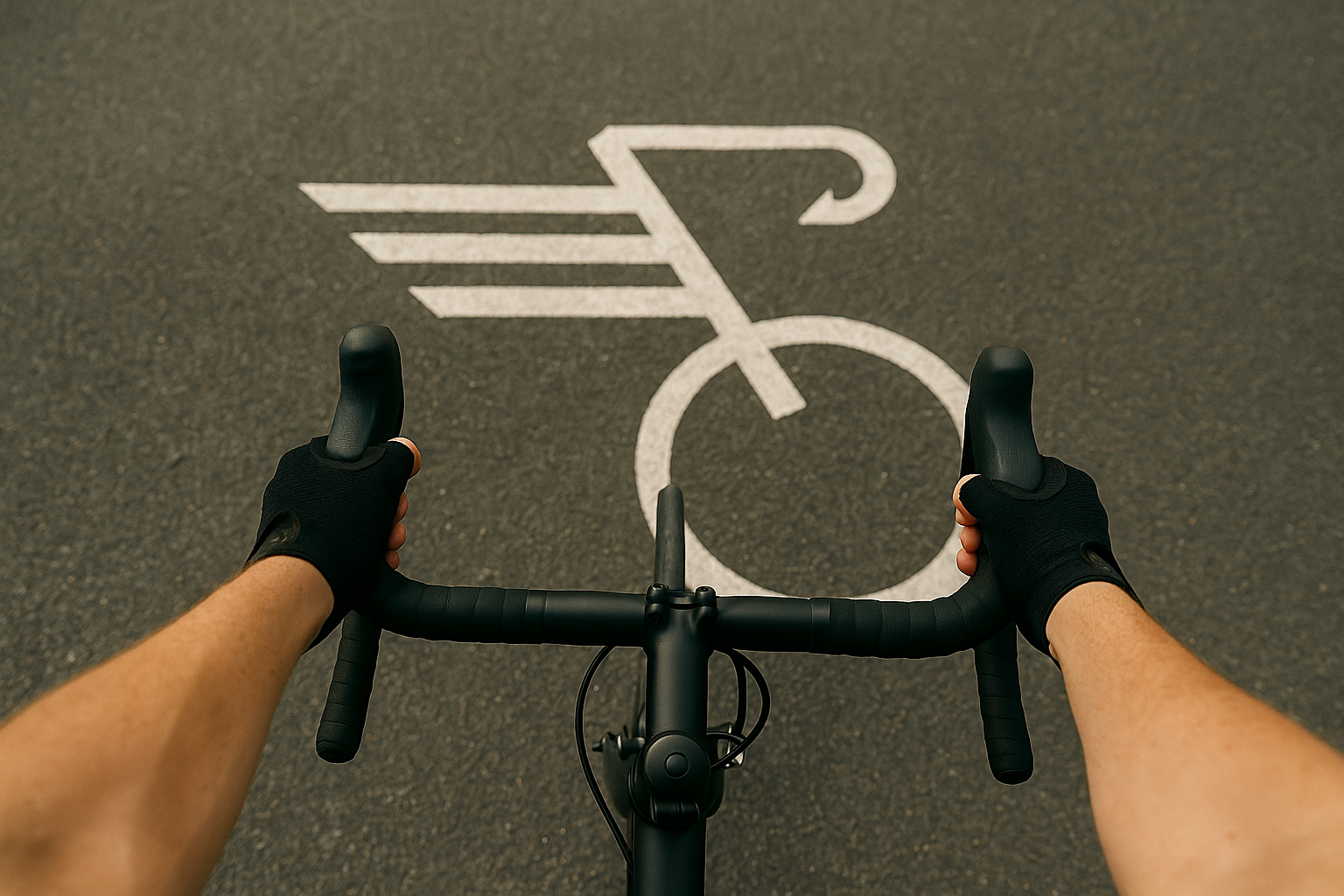
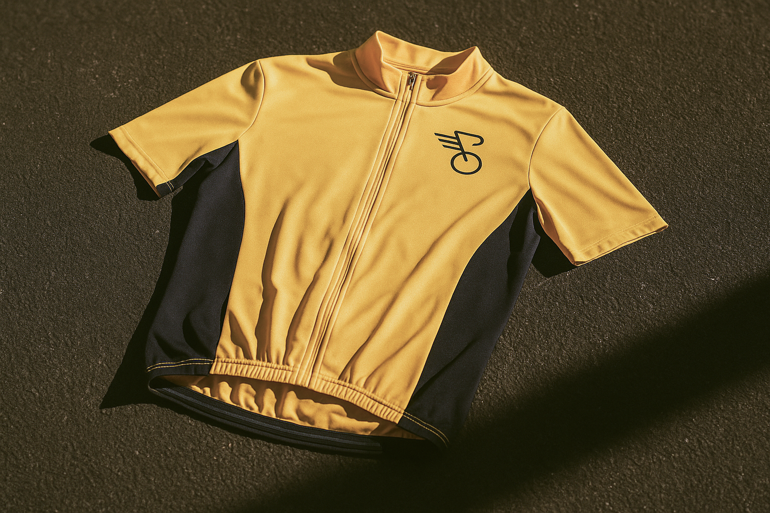
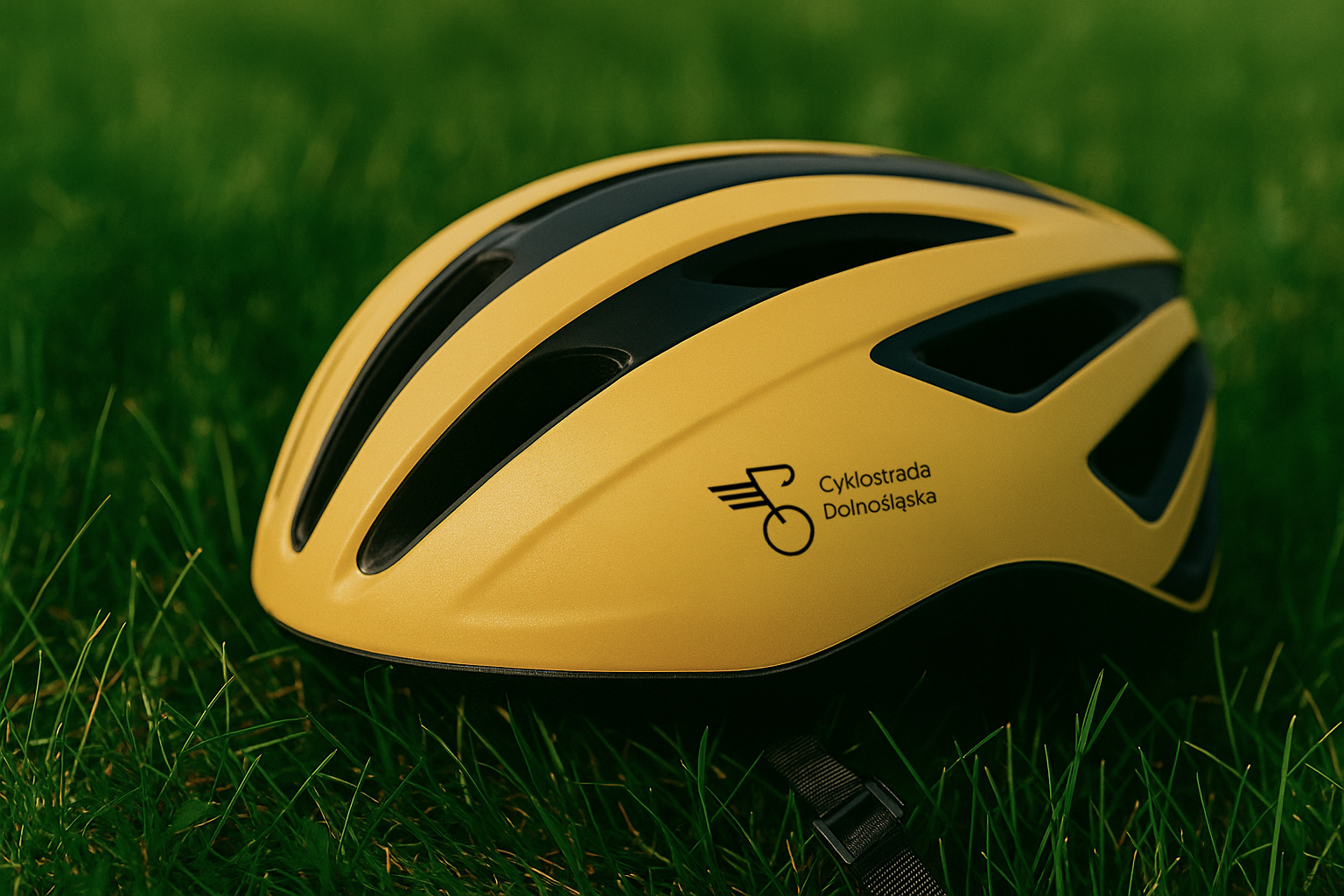
The visual language grew from motion itself. I designed a logo rooted in geometry and speed, supported by a bold yellow and black palette for maximum visibility. Typography was chosen for clarity on the move, ensuring the brand could perform in fast real-life conditions. The system was built to adapt seamlessly across contexts, from signage and maps to jerseys, bottles and helmets.
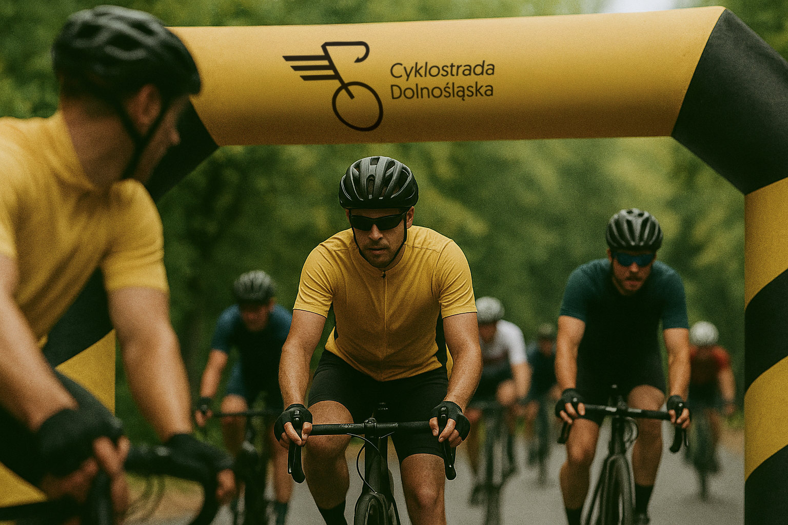
Throughout the process I tested applications in real environments, refining until the identity held up under practical use. The final delivery was a complete branding system with guidelines, rollout materials and imagery that captures the rhythm of cycling in Lower Silesia, designed to unify the experience of the route and give the region a symbol of movement and accessibility.
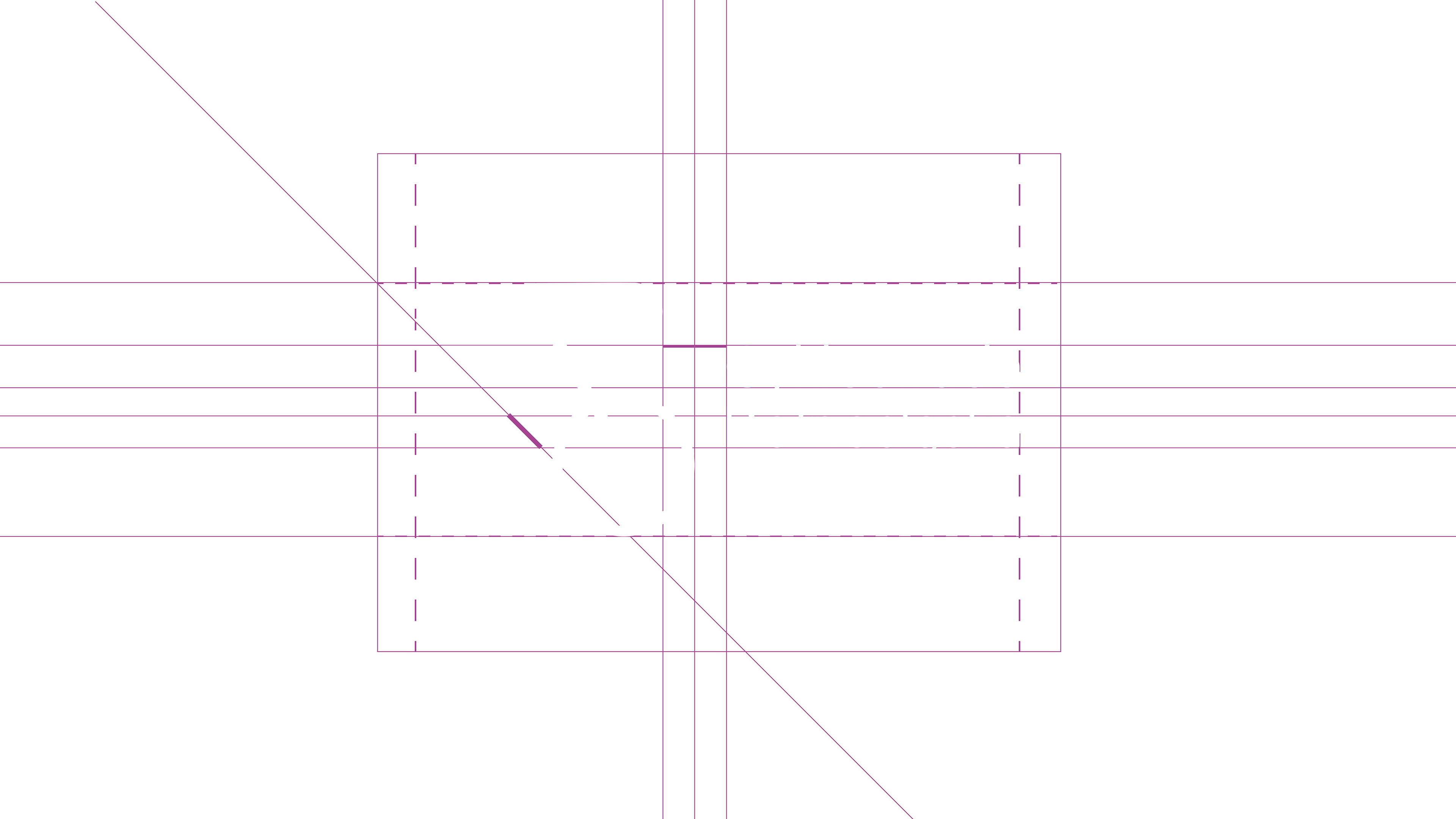
Protective area of the mark
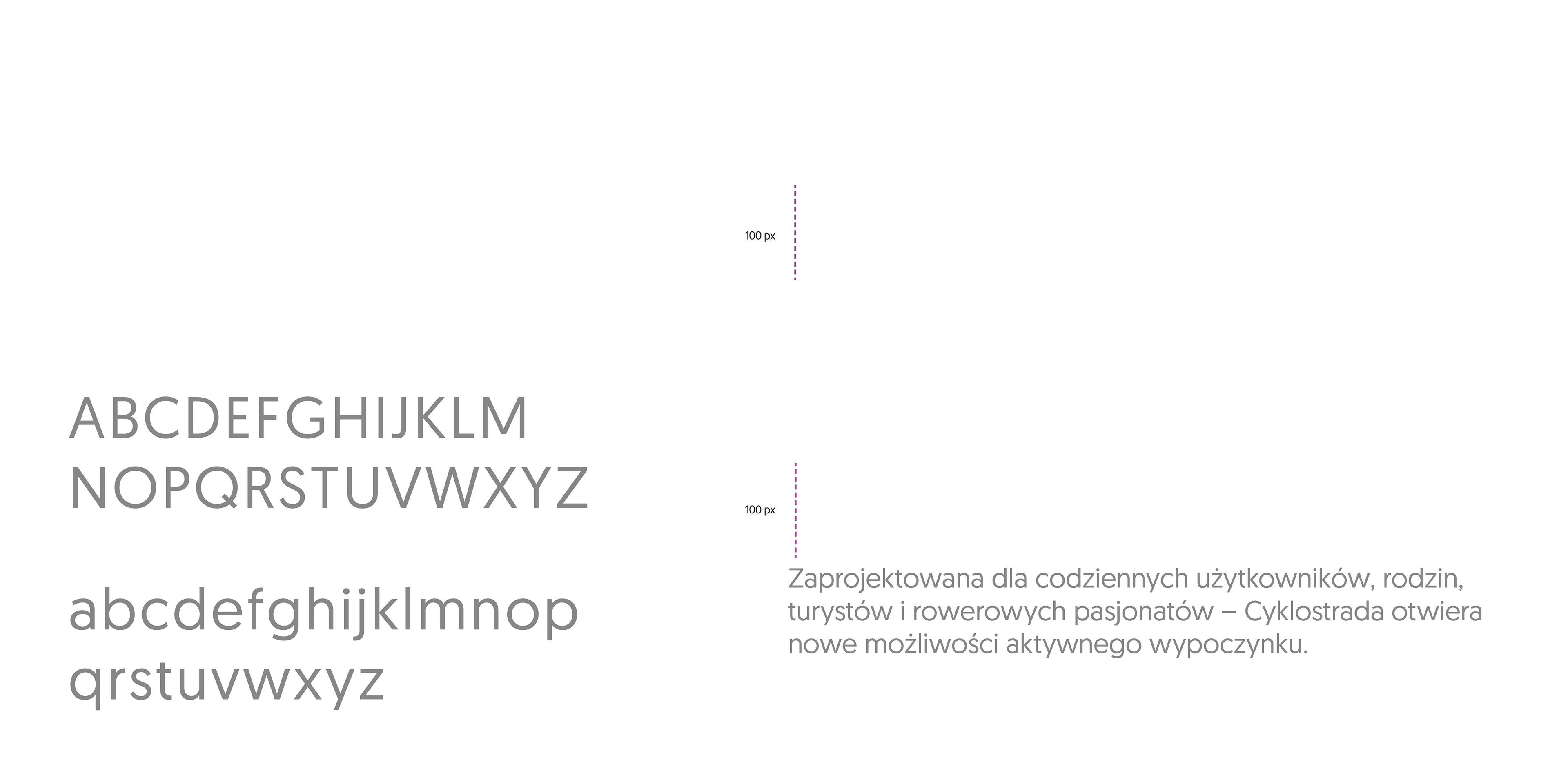
Typography

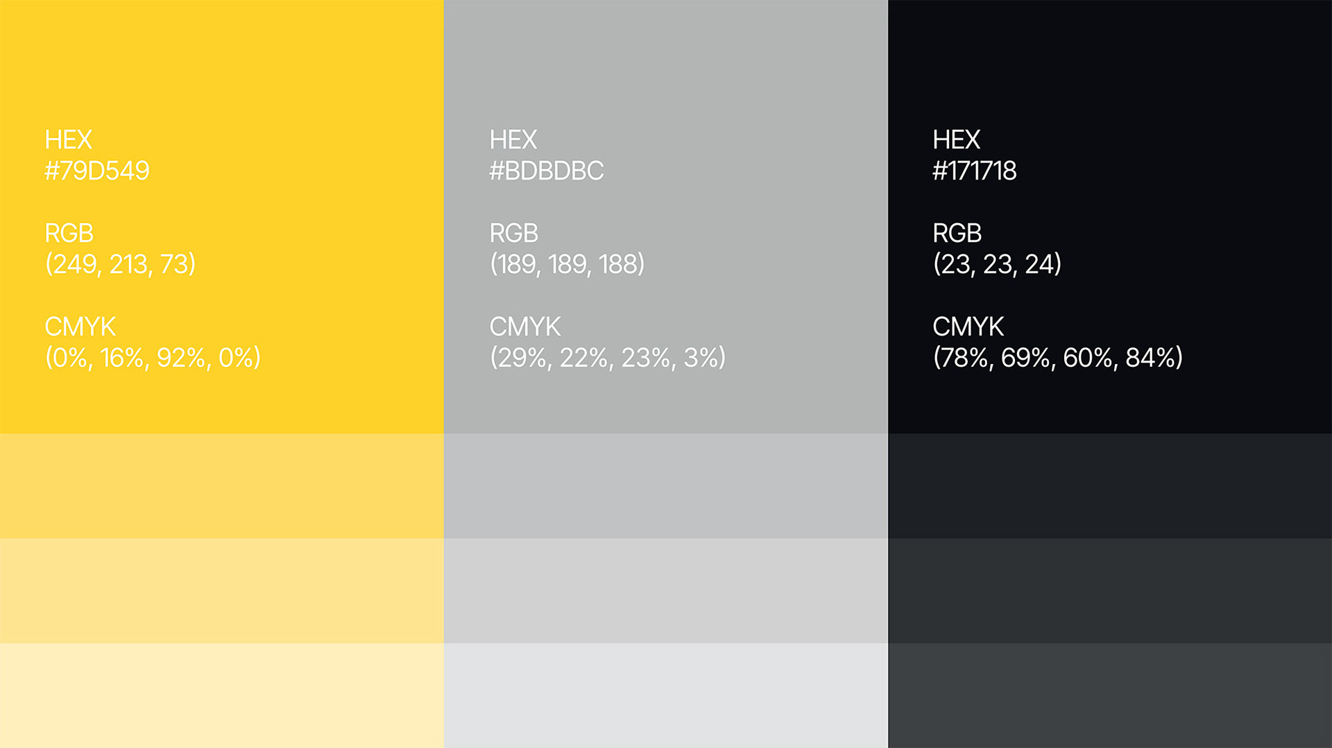
Color palette