Client: Bajola
Challenge: The challenge was to create an energetic yet trustworthy brand.
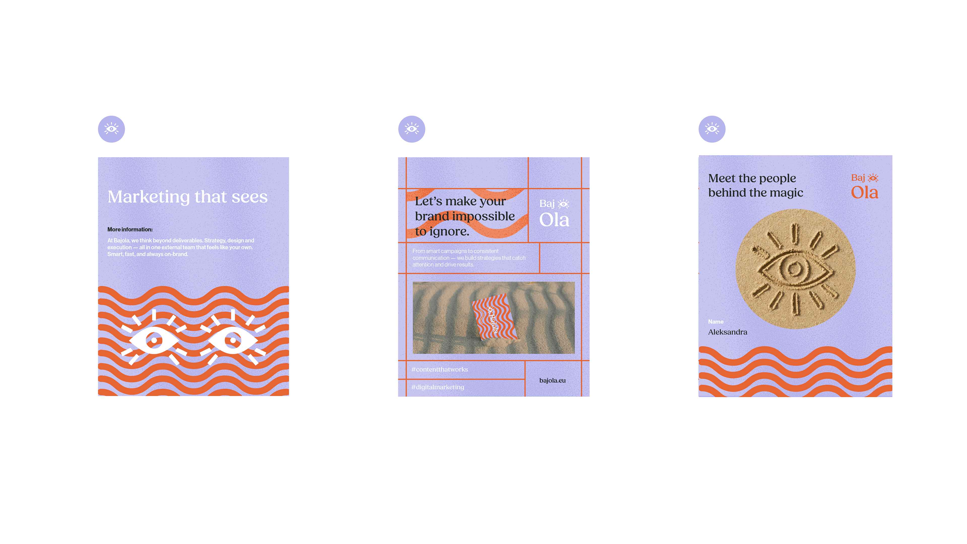
Bajola came to life from the need to bridge strategy, creativity and execution in one agile external team. Research revealed what small and mid-sized brands crave most clarity, flexibility, and bold visibility so I shaped a design direction full of energy and confidence to meet those needs.
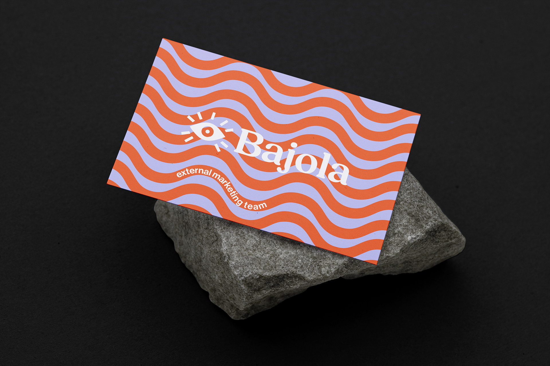
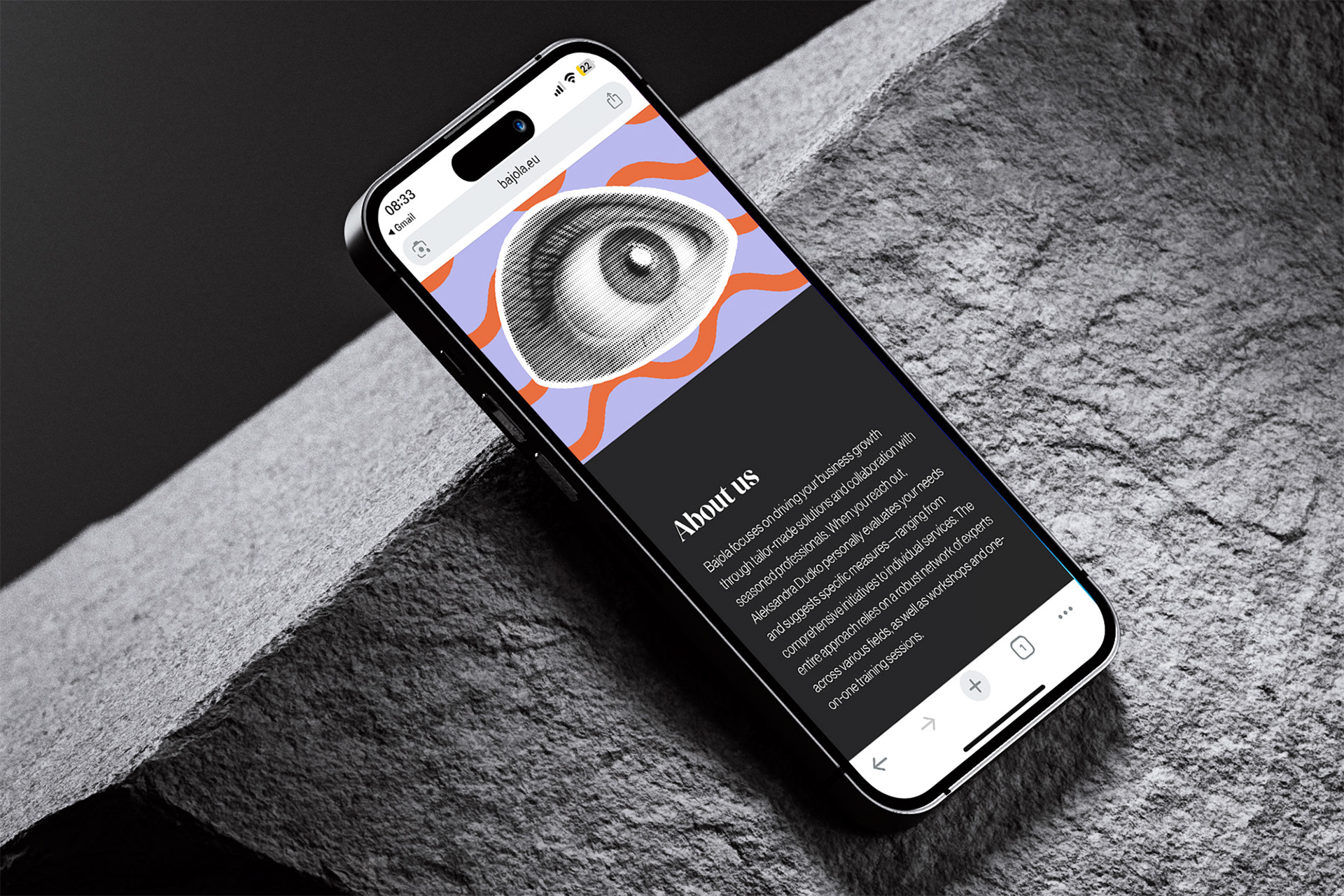
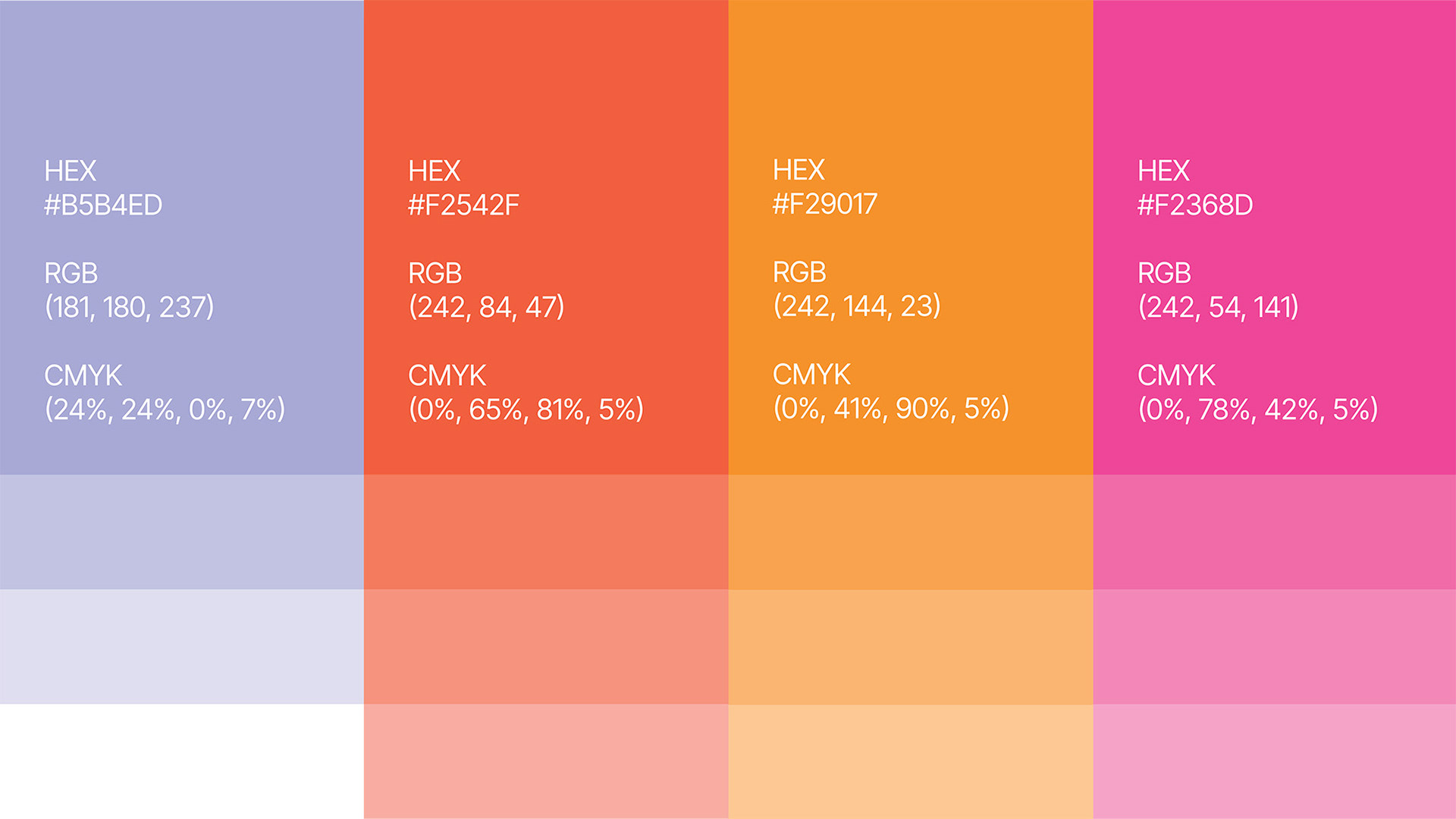
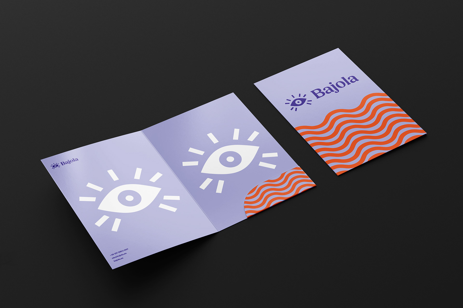
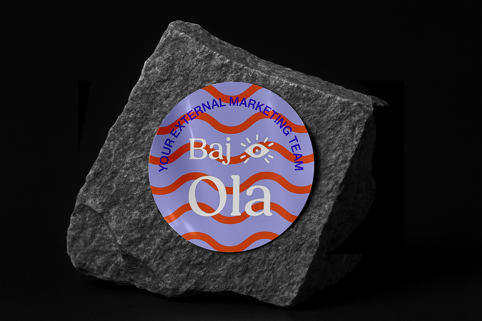
The visual identity leans into contrast and memorability with wavy orange lines that communicate motion and flow, while a bold eye symbol evokes intuition, insight and constant observation. The palette is vibrant, the layout playful yet balanced by elegant typography to make sure expressiveness never undermines professionalism.
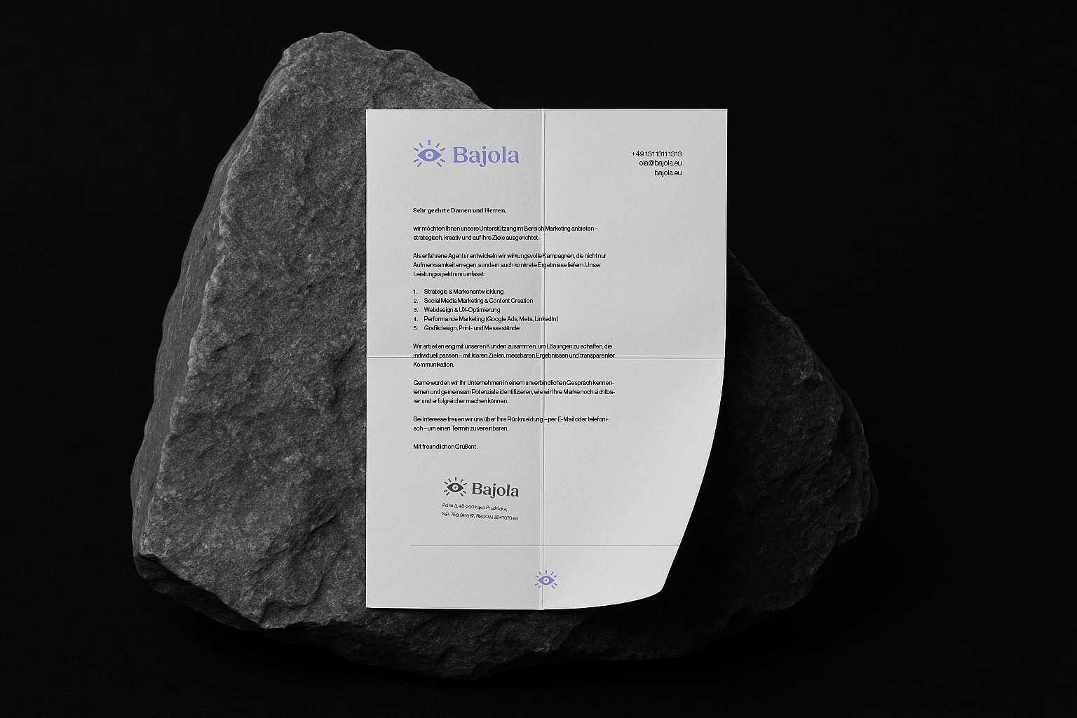
Development spanned from print to digital: business cards, pitch decks, social content, packaging, merchandise and a website built in Webflow. Every element is designed to scale. The result is a lively brand identity that doesn’t just catch attention but delivers clarity and consistency, making Bajola feel like an in-house marketing team even when external.