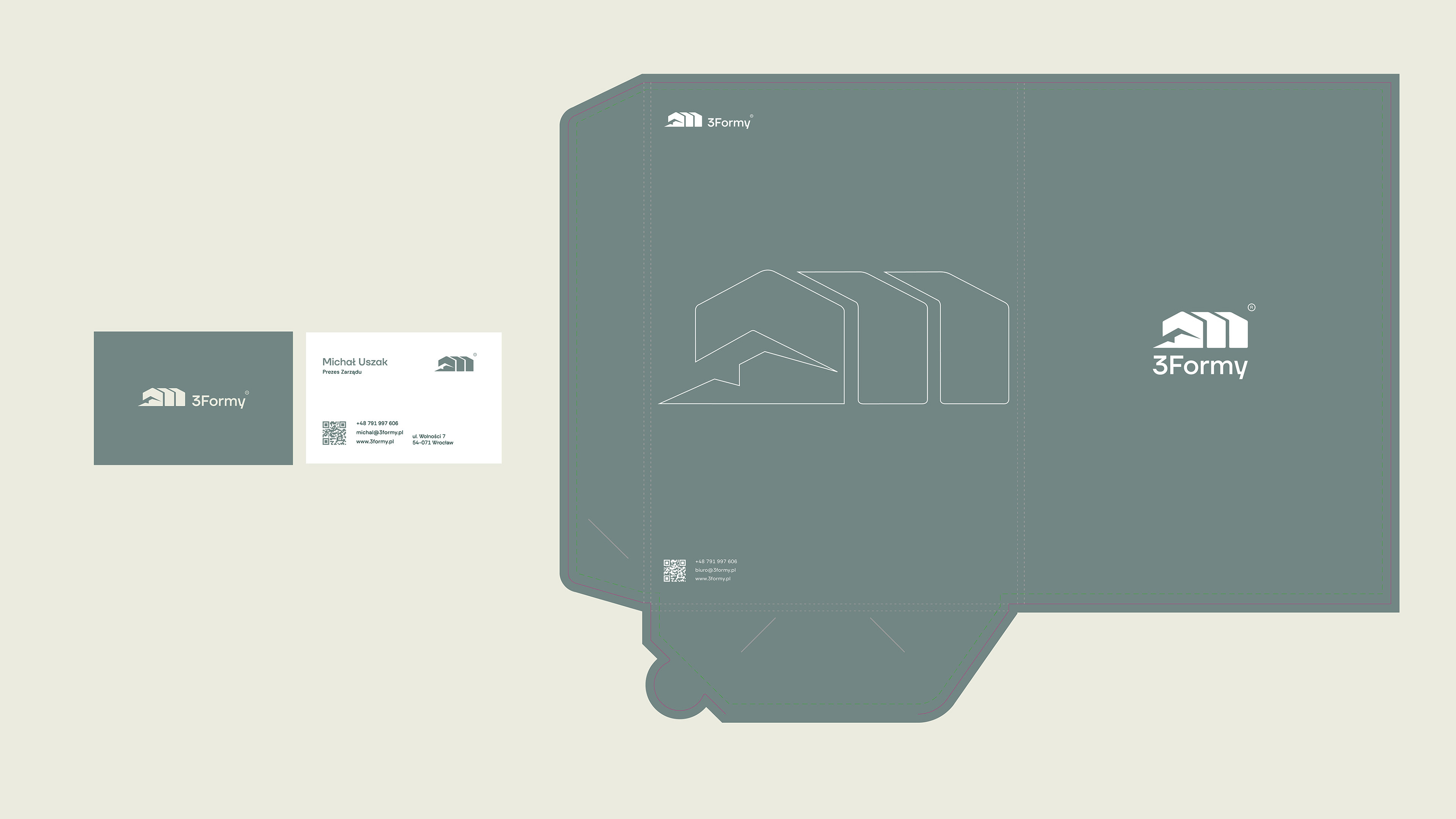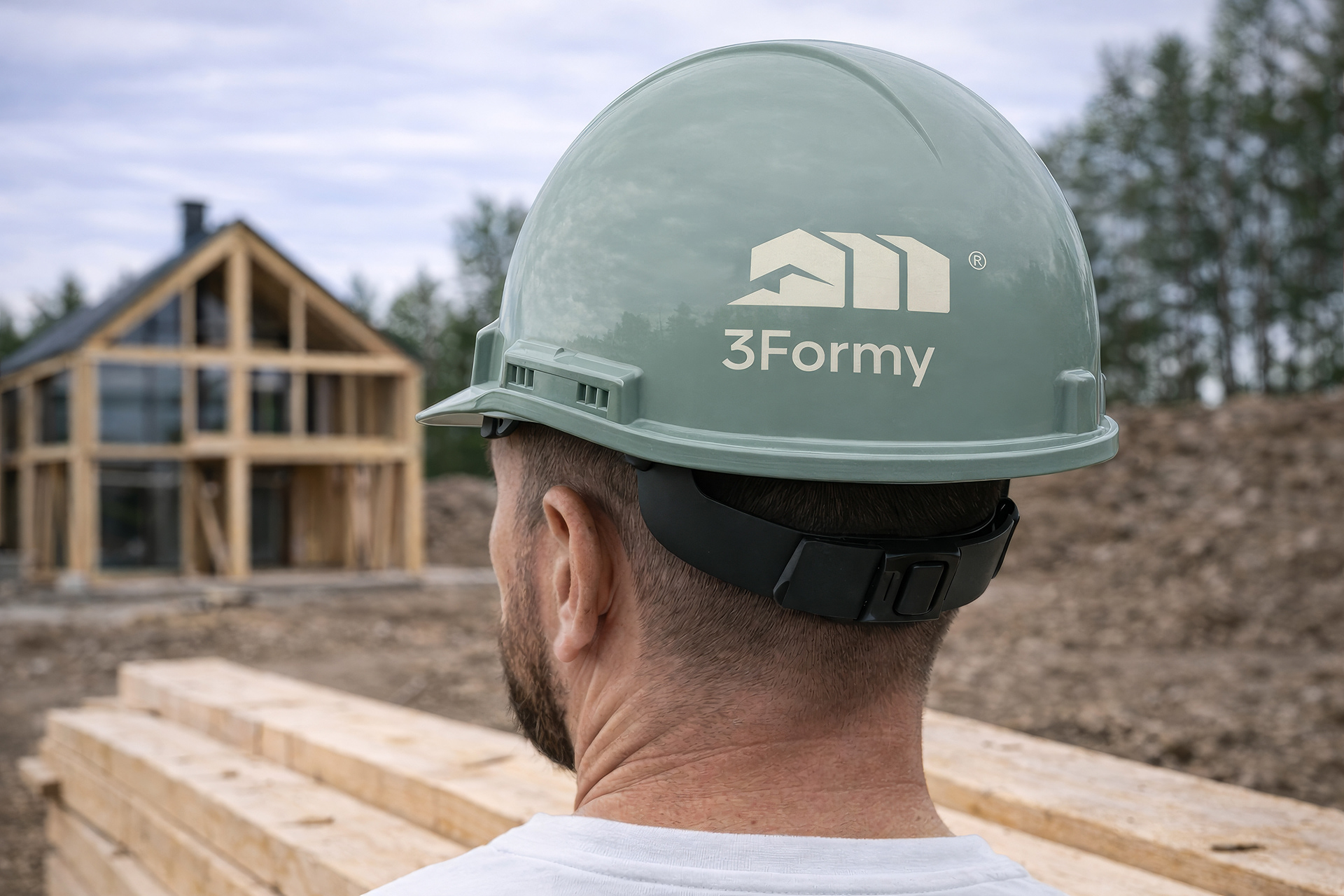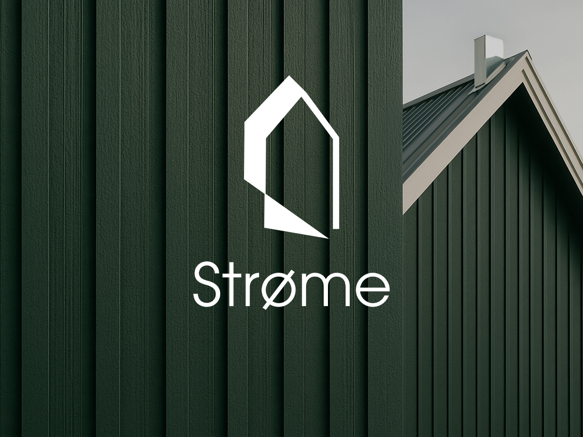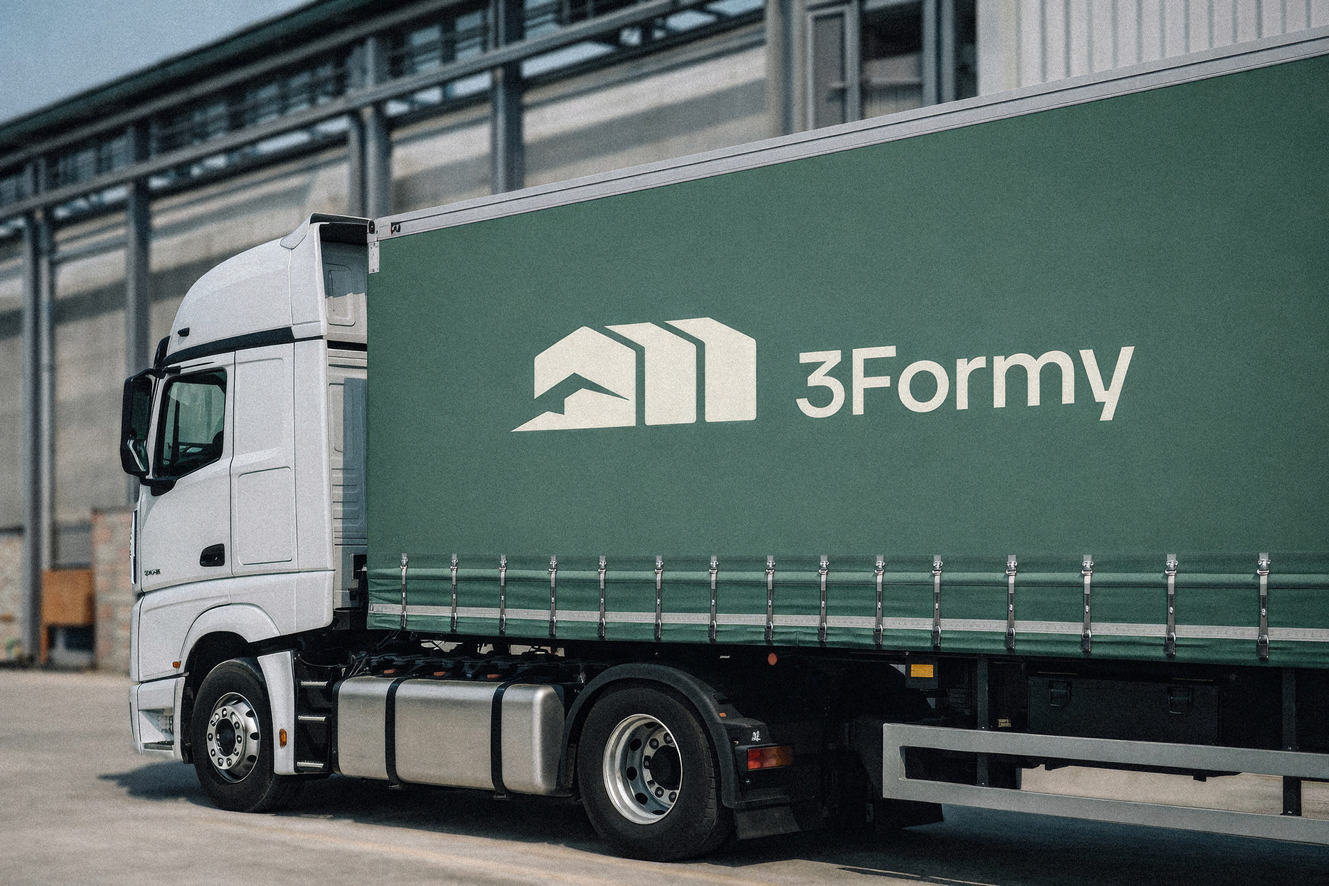
Client: 3Formy
Challenge: The challenge was to create a simple, recognisable and scalable identity.
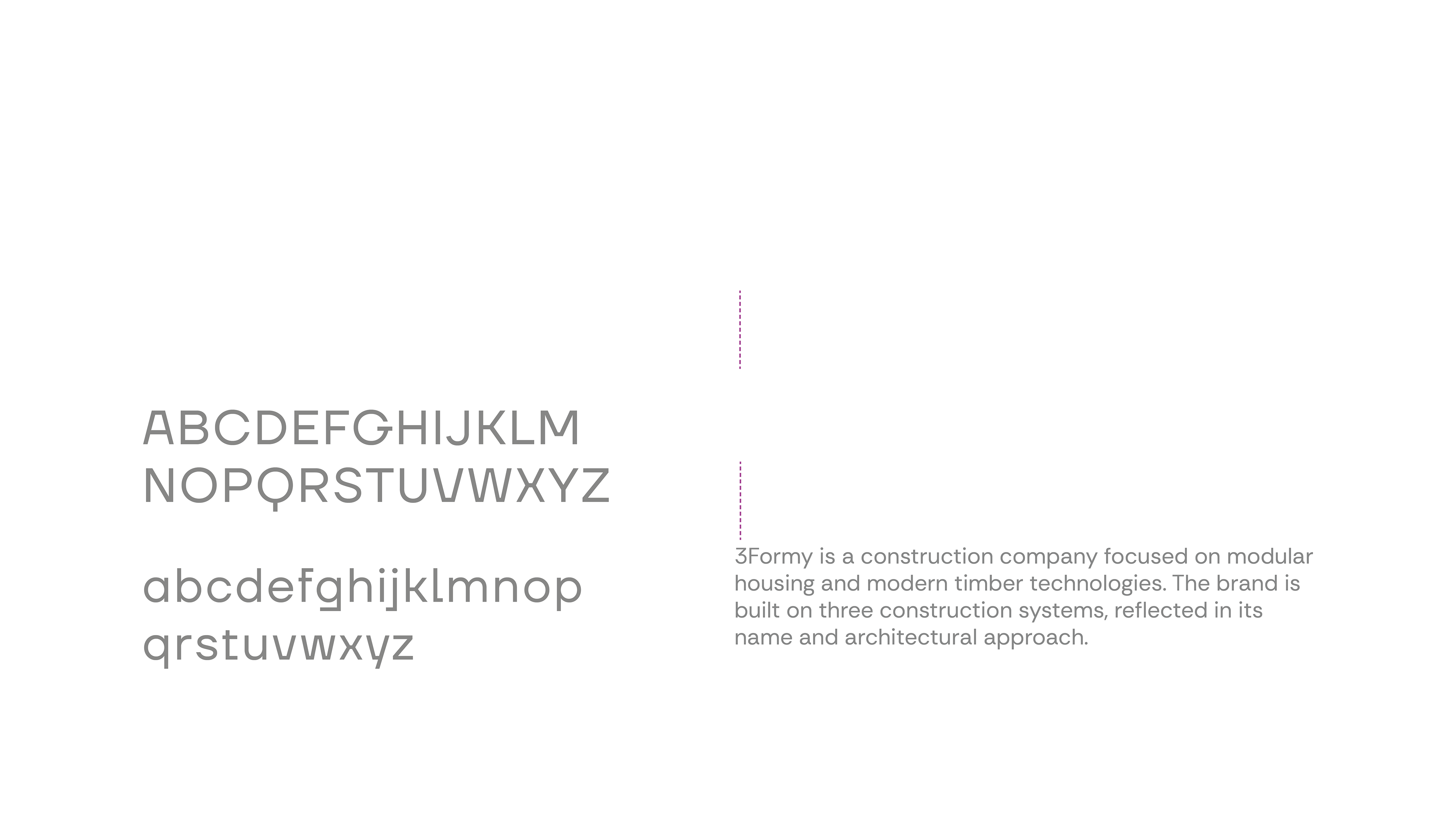
3Formy is a company operating in the modular housing sector, working with three different construction technologies. The goal was to build a brand that clearly communicates this structure while remaining minimal and easy to apply across various contexts.
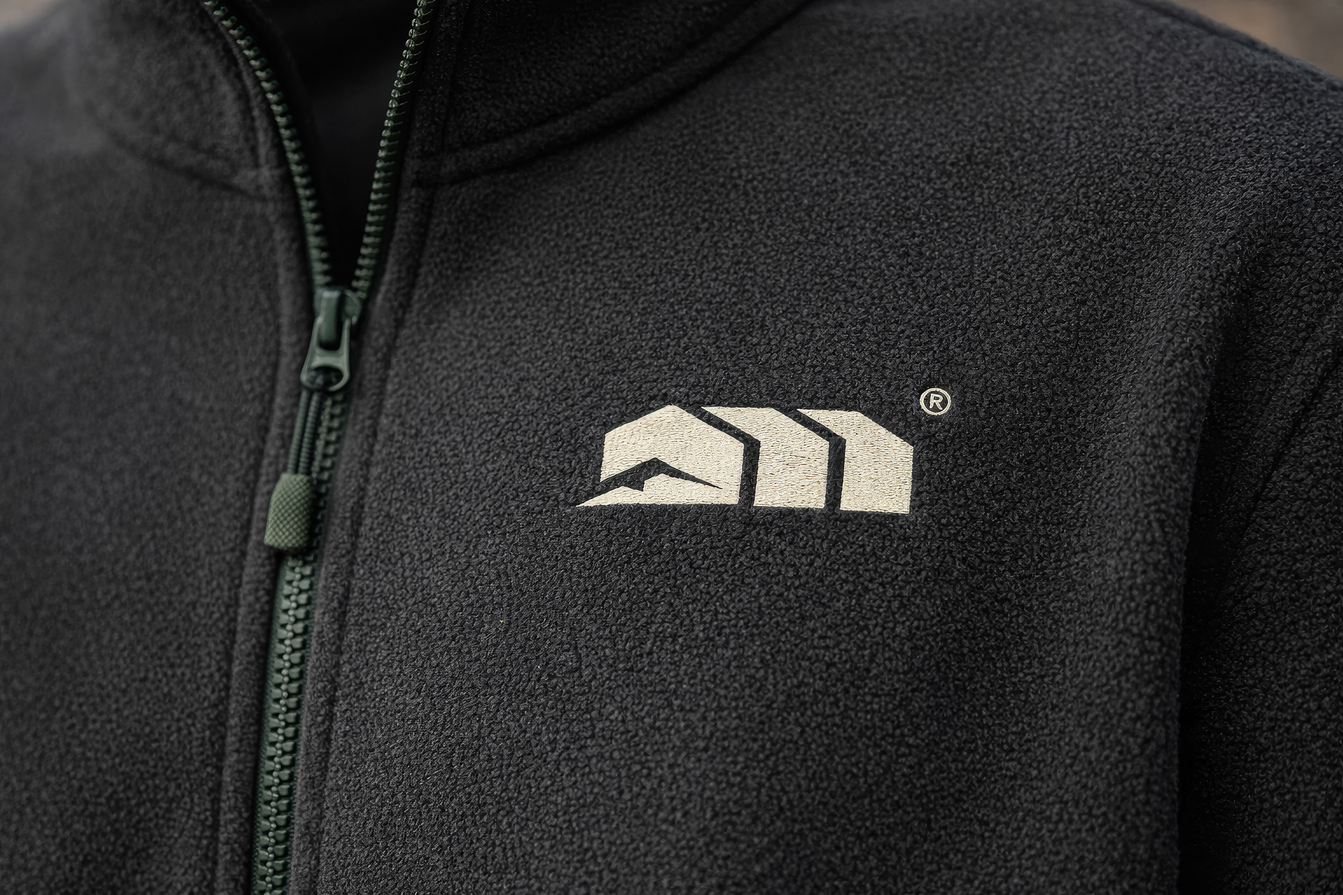
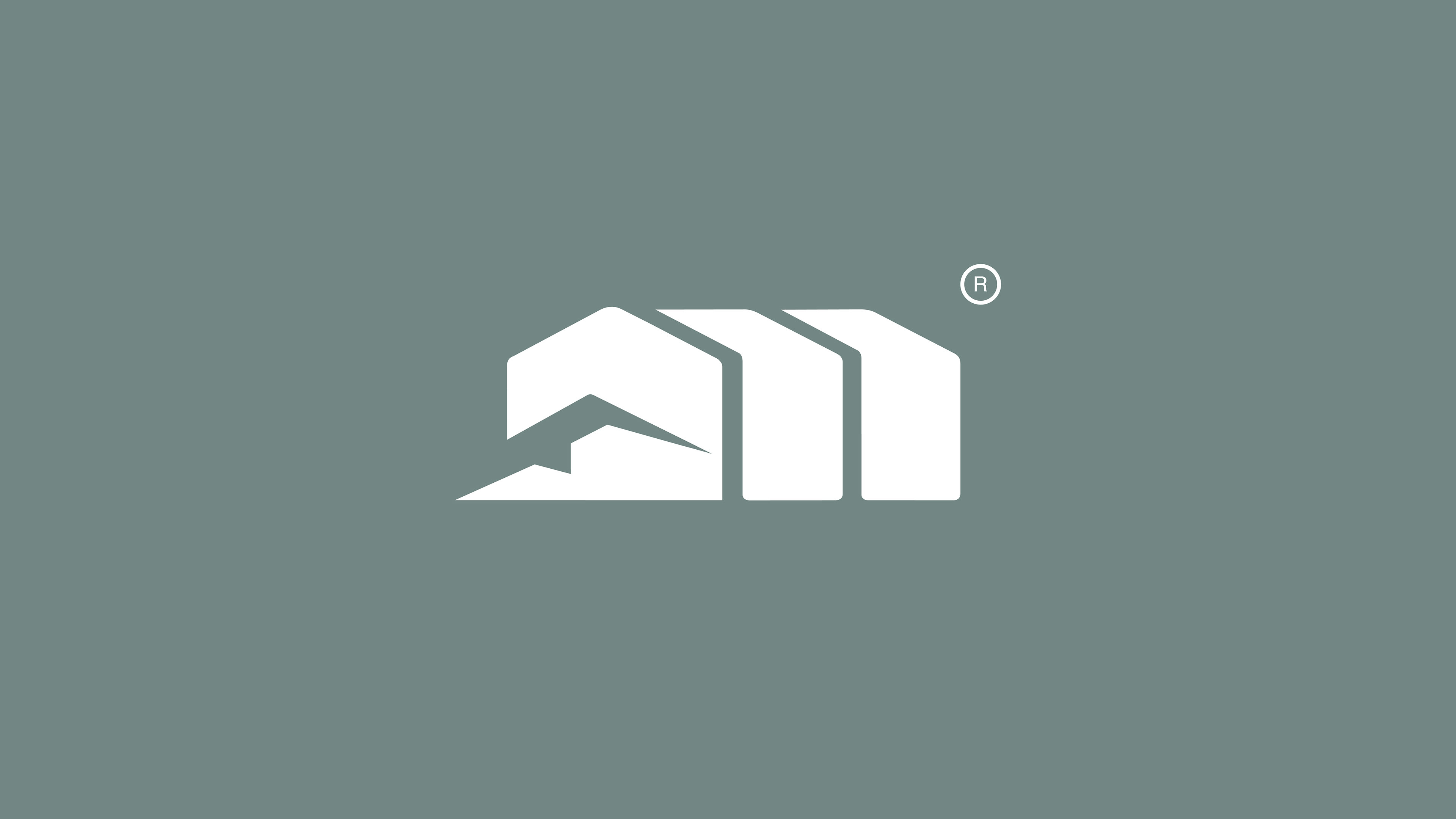
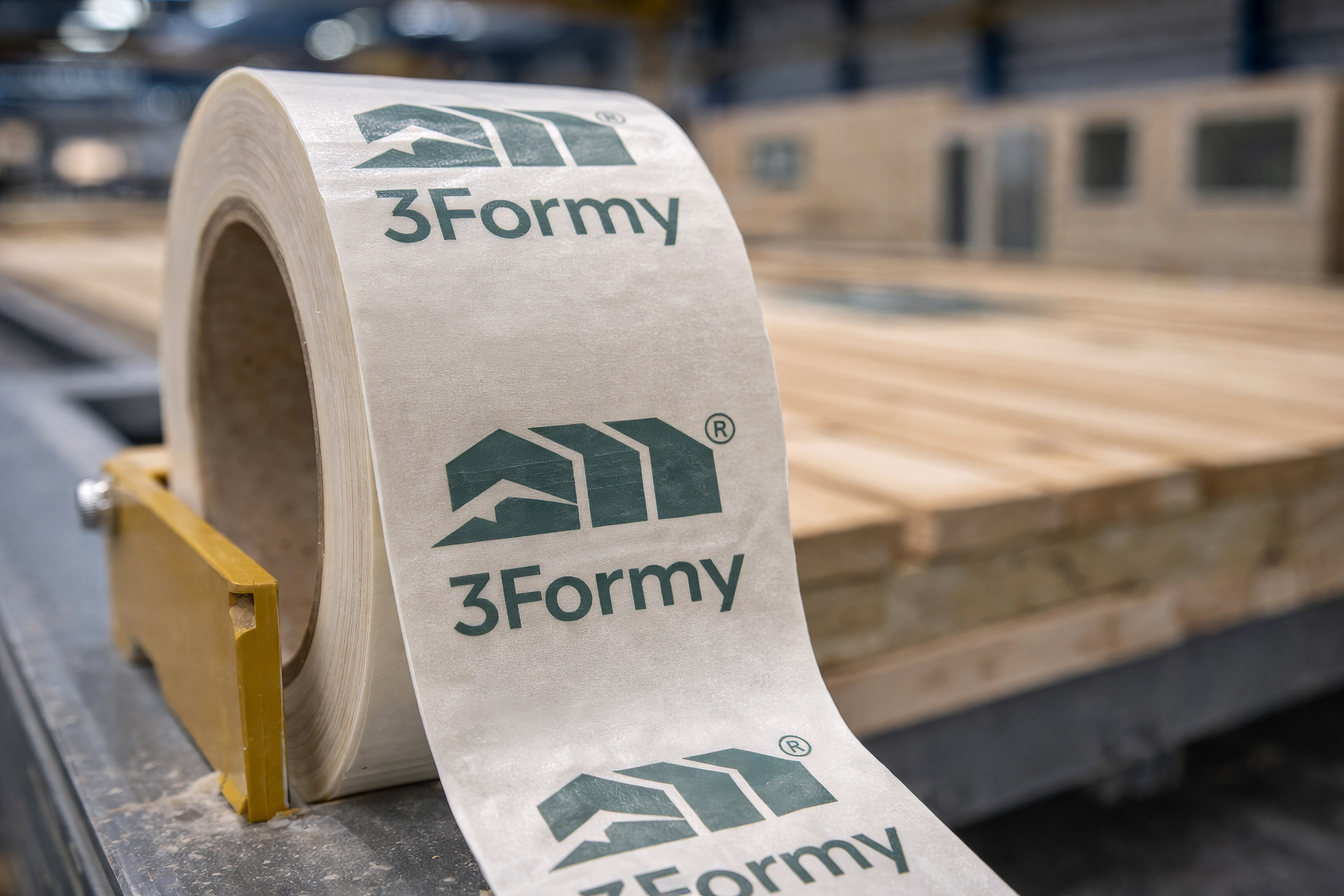
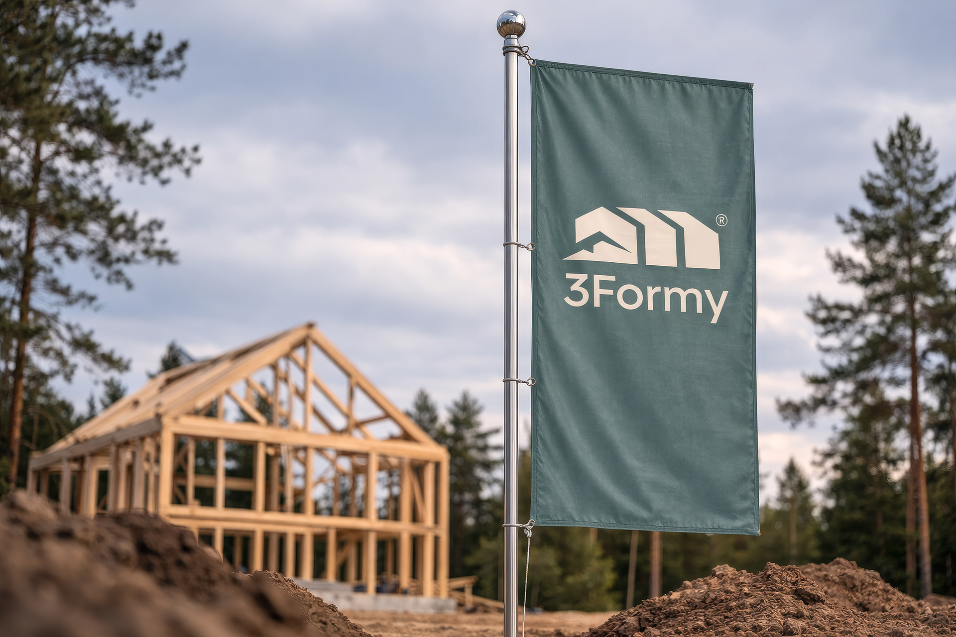
The concept is directly based on the name. The symbol represents three distinct forms that function as a cohesive system, reflecting both the technological foundation of the company and its architectural output. The geometry is simple, repeatable and designed to work in both large-scale and small-scale applications.
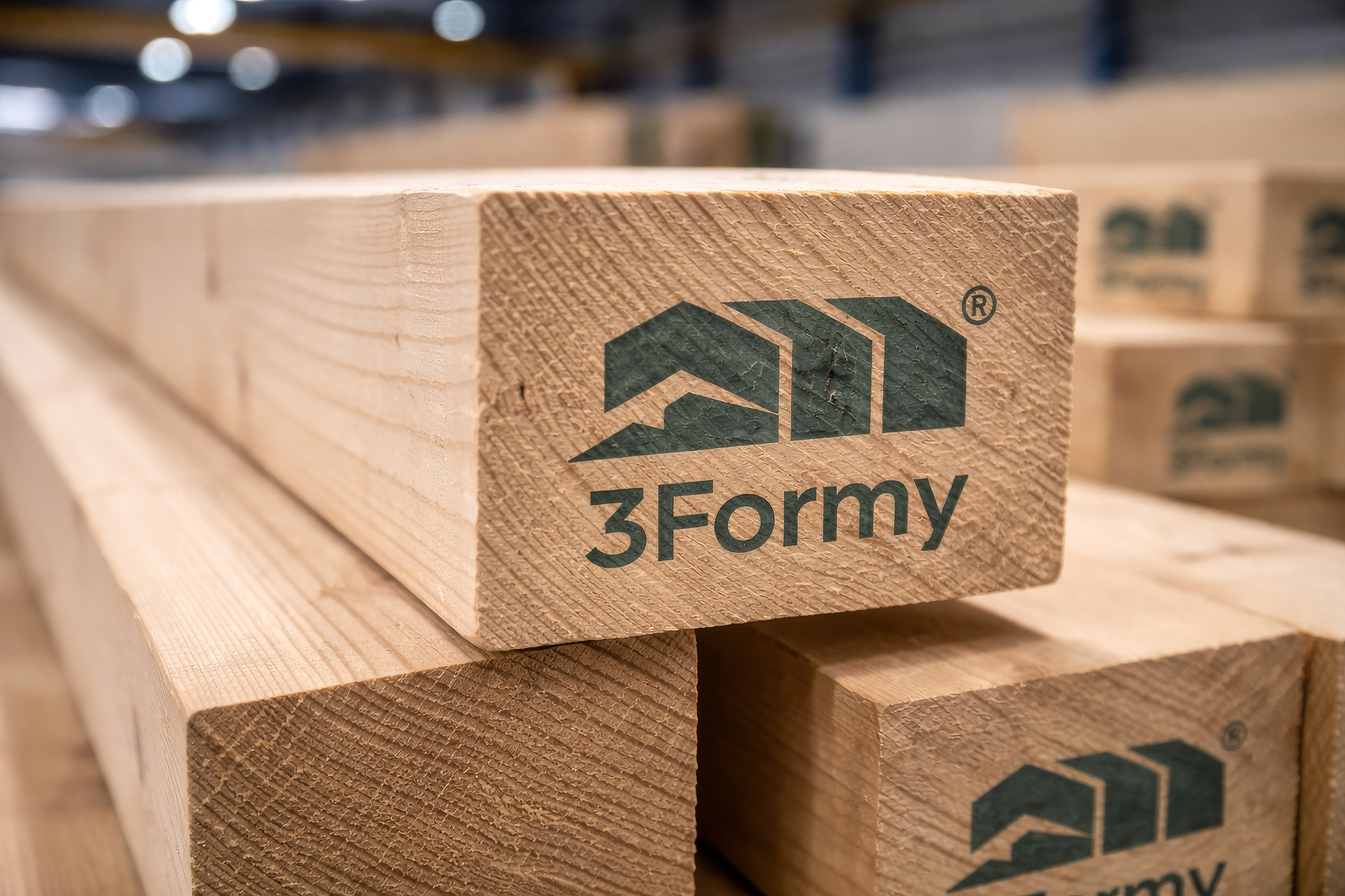
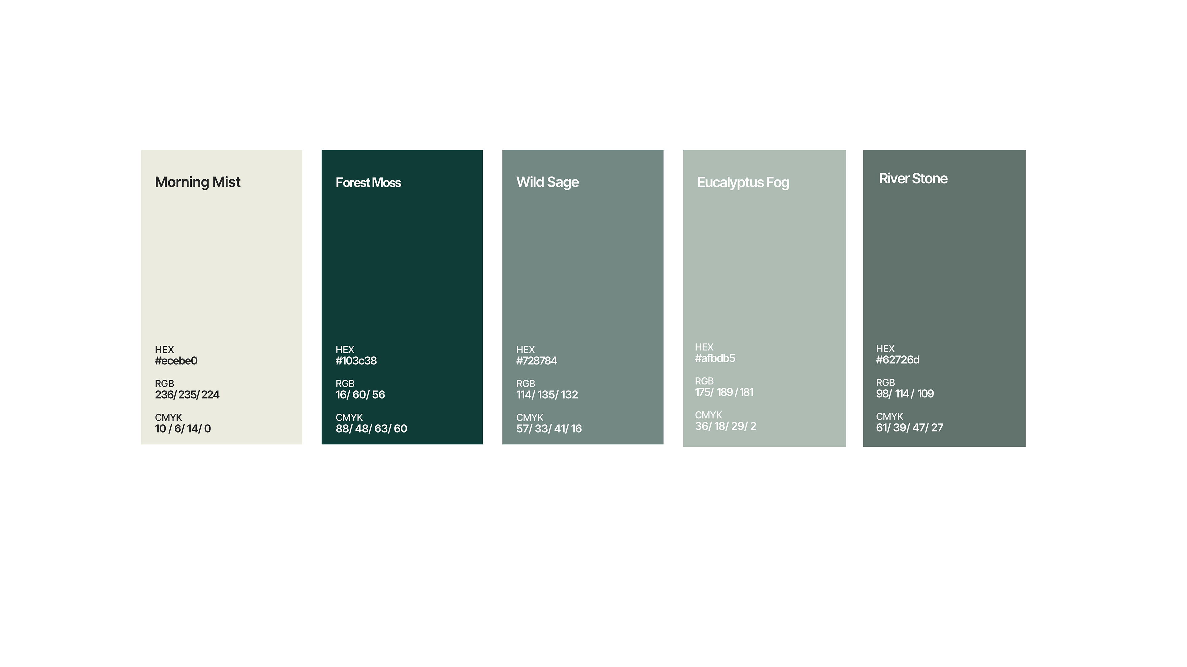
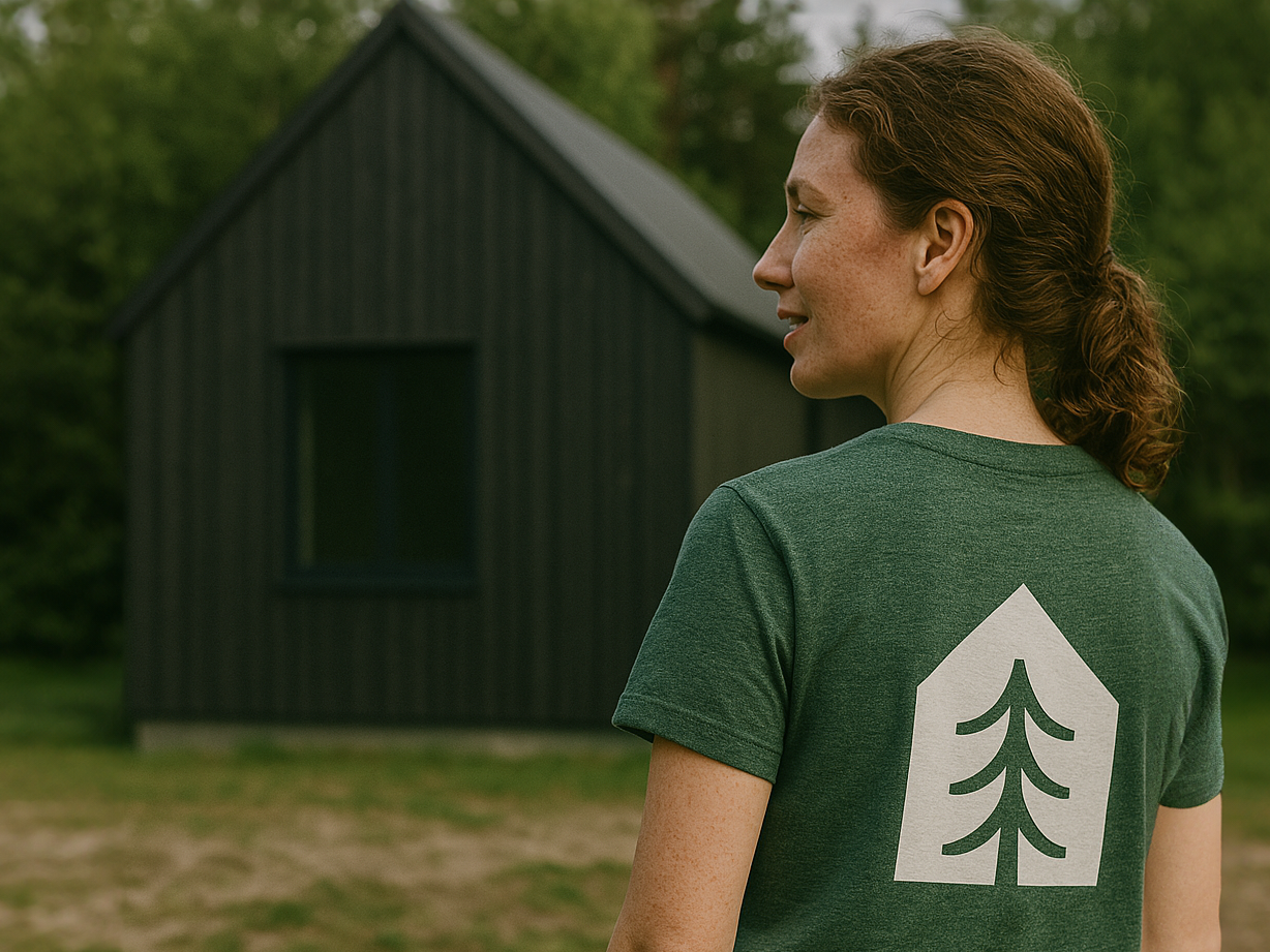
The visual language is intentionally reduced. A limited color palette and restrained typography allow the symbol to take the lead, while maintaining consistency across all materials. The identity was developed with real-world usage in mind. It had to perform equally well on construction sites, materials and equipment, as well as in digital communication and printed assets.
The result is a flexible and durable system that supports the company’s growth and clearly communicates its core idea structure built from three elements.