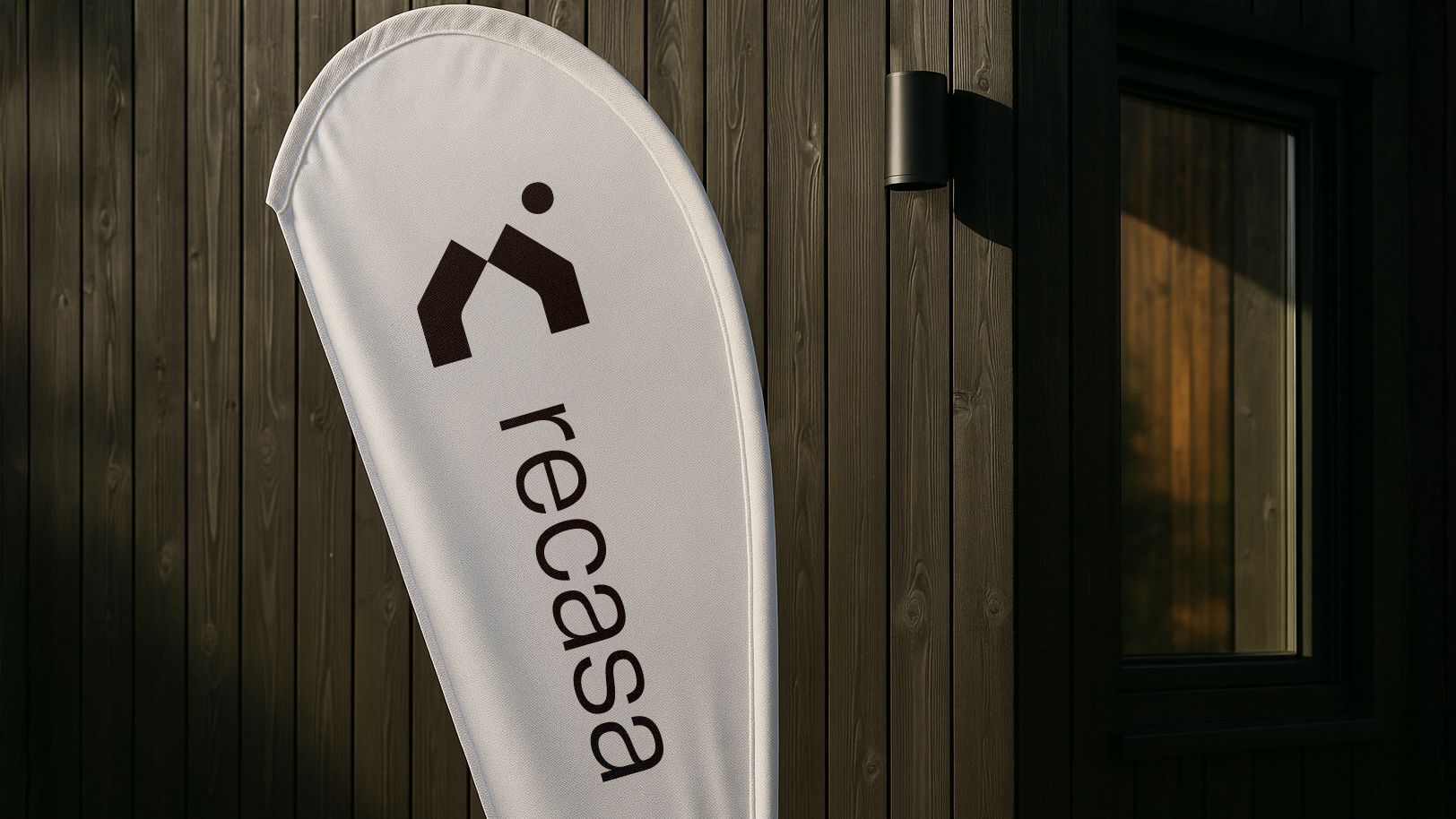
Client: Recasa
Challenge: The challenge was to build a modern and trustworthy real estate brand.
Project for a real‐estate agency reimagined its brand identity and web presence with clarity and premium positioning in mind. Research into the local property market revealed many agencies used crowded visuals and generic typographies, so I set out to design a visual system that would convey trust, elegance and modernity right from first glance.
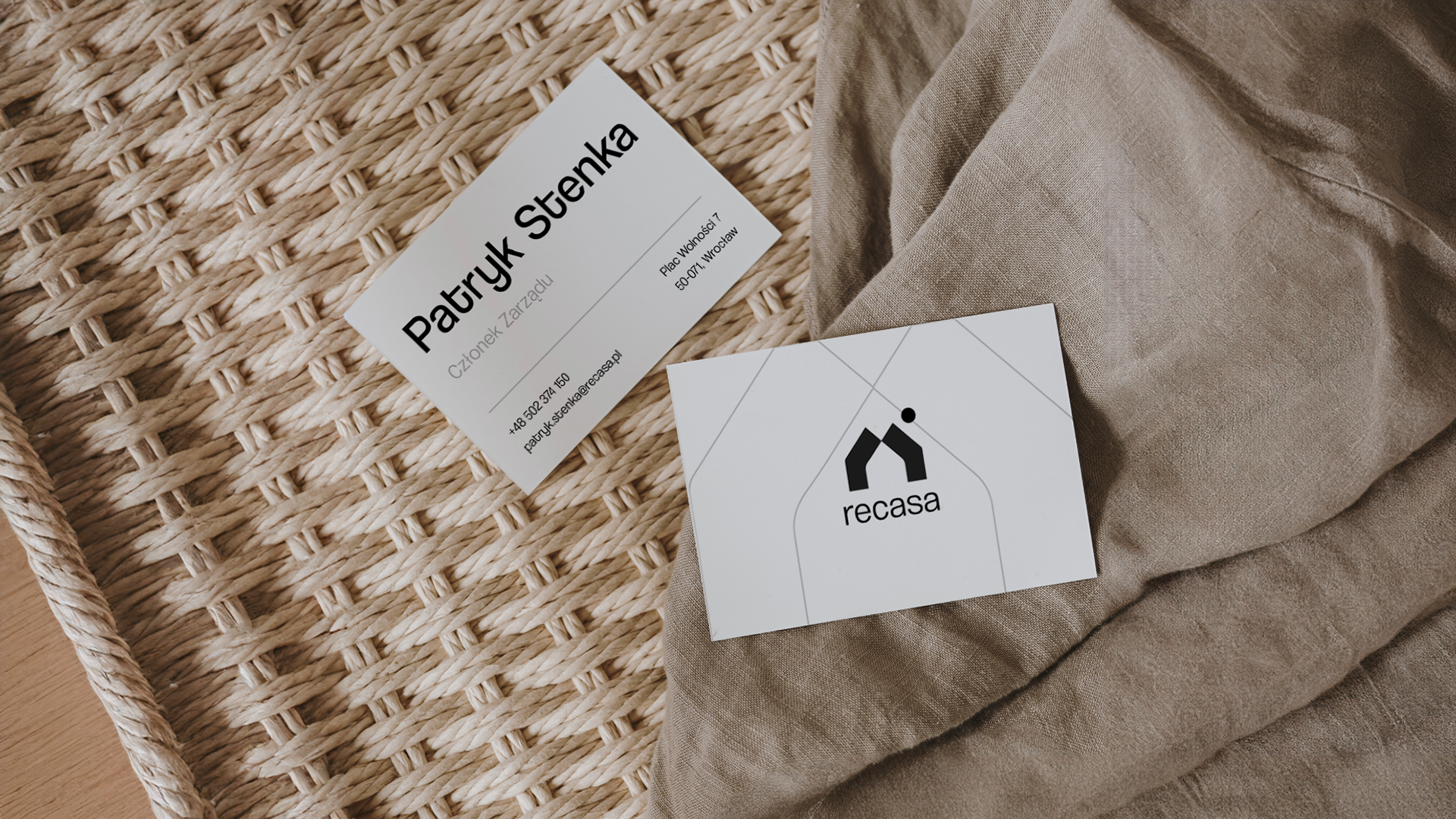
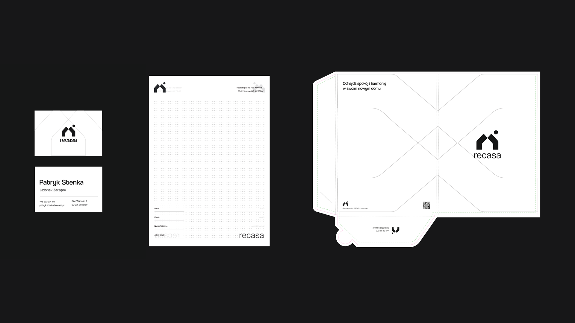
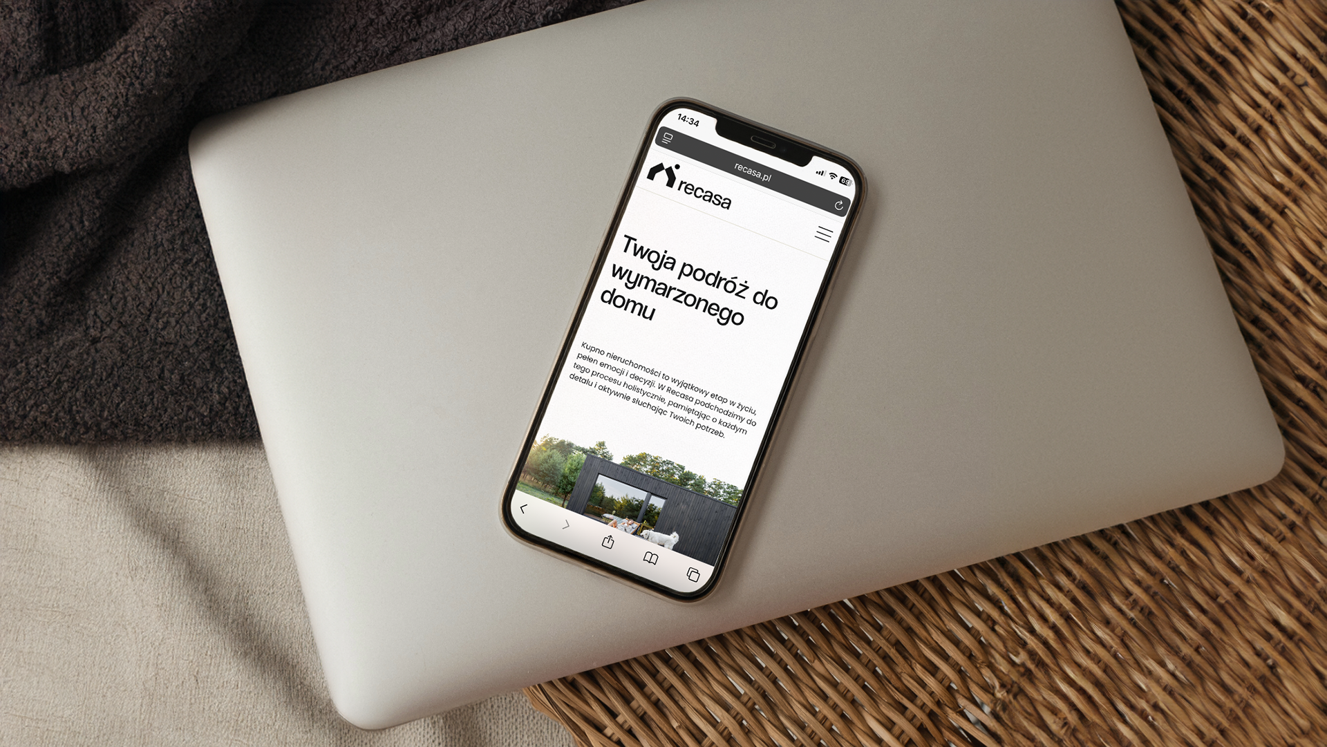
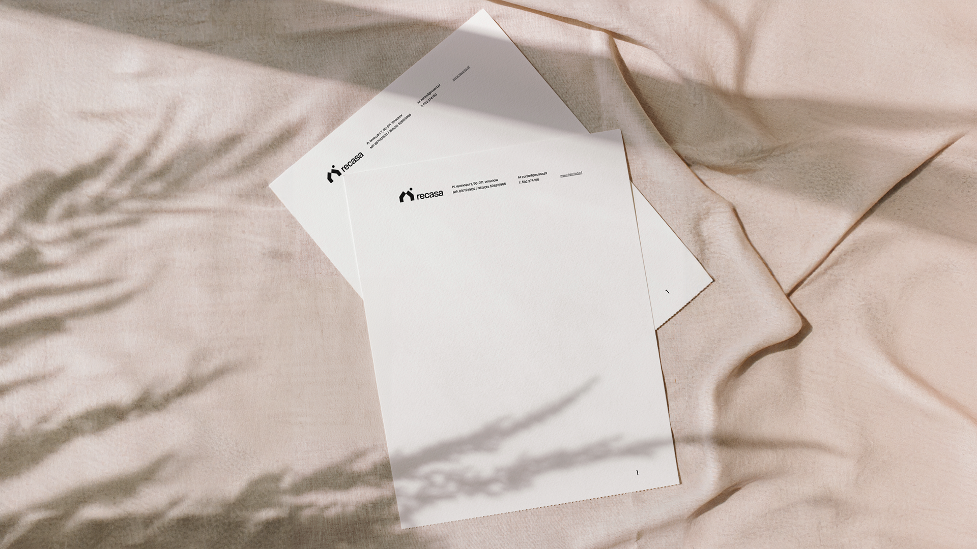
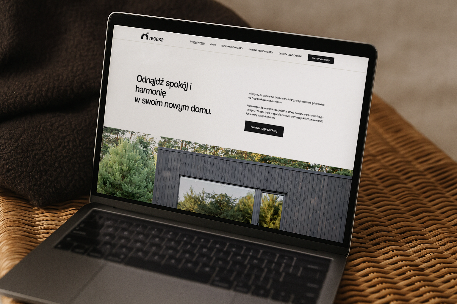
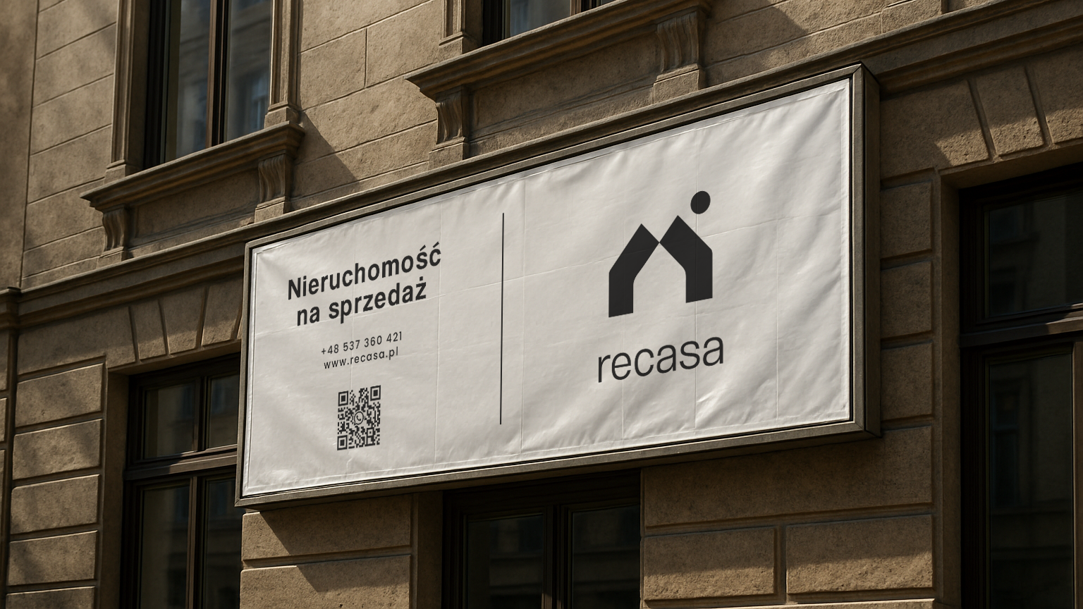
I developed a corporate identity centered on simplicity and refinement. The logo uses clean lines and a strong symbol reminiscent of crest and stability. The color palette is restrained, typography chosen for clarity and authority. Web development focused on intuitive navigation and responsive design so that users find what they need effortlessly whether browsing on mobile or desktop.
The final delivery included a full identity suite and website with brand guidelines, assets, and layout templates so Recasa can maintain consistency across print, digital, signage and property listings. The outcome is a brand that stands confidently among premium competitors, communicates professionalism, and captures the emotions that people seek when buying or investing in property.